Friday, June 30, 2023

Movie Data Analysis using Power BI

I wanted to compare Power BI and Python (and Tableau if I ever get to it) on the data analysis tasks so I figured it would be a good comparison using the movie data (see citation / acknowledgement of the dataset credit at the end) while the data is relatively fresh on my mind. 😅

I'm going through the data similar to what I did analyzing it with Python.  A summary of my findings first -

  • Power BI makes it easier to load / convert / review data.
  • Power BI is easier to create interactive graphical representation.
    • Be mindful the interactive nature of Power BI.  It can also lead to different interpretations based on what filters are set.
    • User can select the field and see the top rated movies or movies with most ratings.
Action Movie Rating Trend & Highest Rated Action Movies
    • There maybe interactive graphical representation Python packages that I'm not familiar with.
  • If you want to see the numerical representation of the 1Q, median, average, 3Q, you will need to create some measures using DAX, and drag in the necessary fields and select the appropriate calculation method.
  • You can only merge two tables / queries at a time.  To merge more than two tables / queries, we need to create a interim table / query then merge with the next table / query.  Although it is the same with Python merge function limit to with two tables, we can nest the merge together, creating a multiple table merge in Python.
  • Unfortunately, after loading in the DAT files and creating multiple tables, the Power Bi file is quite large as compared to Python Jupyter Notebook file (93 meg Power BI file versus 440 k Jupyter Notebook file).  For comparison purpose, the merged data file in CSV format is about 74 meg.
Detail findings - 
  • Data import is as easy as clicking a few buttons.  The encoding issue with Python, as well as separator between each data point, can be easily resolved by selecting from a drop-down menu!

  • Power BI has build-in tools to examine data quality and data distribution, making reviewing of individual columns easier.  However, you need to be mindful of the steps to ensure you review each and every columns, as well as combinations of columns if needed.

  • Note there are options under View - column quality / distribution / profile to show these details in Power Query Editor.  The information is usually based on the first 1,000 rows, so it is best to change the setting to profile the entire data set (see below left lower corner).  They do not provide table level summaries but they provide column level details.  This certainly makes the initial data review easier through graphical review, except you do not get the detail numerical value.


  • To verify if a combination of columns / fields have any duplicates, you can combine the columns together in Power Query Editor, and include a separator if the columns are numeric.  It is not as simple as a line of Python code, but it is easy enough to get done.  Review the column profile / distribution to verify any duplicates.  Side note - I noticed my Intel CPU usage went up while the column profiling was going through.  Is it possible that Power BI uses GPU for processing?  I will have to test it on my desktop computer with dedicated GPU to find out...  😁
Steps to Create a New Merge Column

Column Profiling
  • To split the genres into multiple rows, it is a click of a button within Query Editor using "Split Column" button and click the "By Delimiter," and selecting appropriate options (Advance option to split into rows instead of columns).


  • To see the statistical details of the Ratings table, I have to go through a few steps.
1. I need to create a table to group the Ratings by Movie_ID.
2. I need to create a few measures to calculate the different percentiles, IQR, upper and lower whiskers using DAX.
3. I need to create a table and drag in the appropriate measures and fields and use the appropriate calculation (min/max/standard deviation/etc).


4. Alternatively, you can search the Power BI add-in by clicking the 3 dots for more visuals and search for box plot and third party visual add-in.


5. I found a Box and Whisker by MAQ software to provide a good box plot visual with all the details.


  • Part of the initial EDA is to recognize that there are many high ratings (rated 5) movies with single user ratings.  On average a movie would have ~269 ratings with the median ~ 123 ratings.  On my Python analysis I went with the median instead of the average to filter out movies which do not have enough user ratings.  To do the same within Power BI, I add in a slider and use the Rating count within the Rating_group table.
    • Slider makes it easy to change the boundary in case the user prefer to use average instead of median, or if the user wants to see the unfiltered result.


With some drag and drop and copy and paste, it is easy to create a few interactive summaries - Top 10 movies by rating and count by gender, Top genres by rating and count by gender, and # of rating and average rating over time, all with a slider to control the minimum number of ratings to prevent low number of ratings skewing the results.

Top 10 Movies
Top Genres
Genre and Rating over Time

Issues:

Found an interesting issue that when I use Python to plot the box plot, the plot is different when I have one or two variables in the x-axis.  I'm not quite sure what the problem is, but it does not match my calculation (shown in red box below) or Python's estimate.  


File upload:

You can find my Power BI file here.

Citation:

The dataset is downloaded from https://grouplens.org/datasets/movielens/1m/.  This is the old dataset from 2/2003.  

Acknowledge use of the dataset:

F. Maxwell Harper and Joseph A. Konstan. 2015. The MovieLens Datasets: History and Context. ACM Transactions on Interactive Intelligent Systems (TiiS) 5, 4: 19:1–19:19. https://doi.org/10.1145/2827872

Thursday, May 18, 2023

Getting inventory info for open orders

My wife is really good at giving me Excel challenges to say the least.  😅 

She's been spending a lot of time reviewing her open orders to locate available inventory from different warehouse locations.  Her company's system apparently does not add up available inventory from different warehouses for order coordinator to process the open orders, resulting late shipment and missed sales.  She has been watching Kevin Stratvert and Leila Gharani on Excel over the past couple of years and wants to link her files with Power Pivot to show the info.  Somehow her file keeps telling her that there is missing relationship, and the quantity shows the total inventory, regardless of product # or warehouse location.


I receive the three reports - product report, inventory report, and the order report and jump right in.  I figure this can't be that complicated because any companies dealing with physical goods and multiple warehouses will have the same challenge.

Reviewing the three reports to identify their unique identifier, if any, and their associated fields is the first thing before any analysis.

Product report

Primary key / unique identifier - product #.


Order report -

Primary key / unique identifier - there isn't one.  It seems we are missing some information to use this report directly as a database table.  There should be another table in the system showing what products are contained in each order.


Inventory report -

Primary key / unique identifier - there isn't one.  We can certain create an unique identifier using the combination of product # and storage location ID, but we will also need to create a storage location report to include all the unique storage locations.


Traditional database tables must follow certain requirements - each column in a row can only contain one value; no duplicate rows; each row must have a primary key.  Two of these reports (order and inventory) do not follow the table requirement, so they were likely created with combination of tables to display the necessary information.  That said, to achieve our goal to display the inventory information next to the order quantity, we can use Excel's Pivot Table and vlookup function to accomplish this task.

I generated the sample reports using ChatGPT and provided the fields I want to include, thus the same number of products in the product report are in the inventory report.  We can skip loading the product report considering the inventory report is a more complete version.  However, we need to reorganize the inventory report so each product only has one row, and list out each storage location and quantity in a different column for easy matching.  This can be done by using using Excel Pivot Table.


(If you're not familiar with Pivot Table, Microsoft support has a basic tutorial here.)

I want to say that I'm done considering the bulk of the issue is trying to display the inventory information next to the open order, except it's not.  😬  The challenge is trying to automate the process as much as possible, so order coordinator can review the open orders and figure out how to process.  

*side note* Considering how much progress Microsoft has made in the last few years to incorporate other providers into its ecosystem, I was hoping that I could easily connect to my files through Google Drive for demonstration purpose...  Well, it's not.  One provider charges $700+/year for 3 license for Power Pivot to connect to Google Drive.  Microsoft has more work to do to expand their free connectivity with other providers! 

With Power Pivot, we can either start with a new Excel file and link the two report files, or we can start with one of the report files and link in the other one.  Our goal is to ensure easy update / report refresh so we must start a new Excel file and link the two report files.  This way we can re-run the reports and save over old files every time to refresh the data for updated data.  This should work in Microsoft share point or within a Windows network drive setup.

  • To connect the files, go to Power Pivot ribbon on top and click Manage on the leftmost Power Pivot ribbon.  It will open up the Power Pivot for Excel in a separate window.

Power Pivot ribbon

Power Pivot for Excel

If you do not have Power Pivot on the top ribbon, please see this Microsoft link for instruction.

  • Click the icon From Other Sources, and scroll down to import data from an Excel file and click Next >.


  • Click Browse and select the order_report_sample file and click open.  Click Next >.  Make sure the file is closed before you import or Power Pivot for Excel will ask you to close the file.


  • Select "Use first row as column headers." because our first row is the column headers, then click Next >.
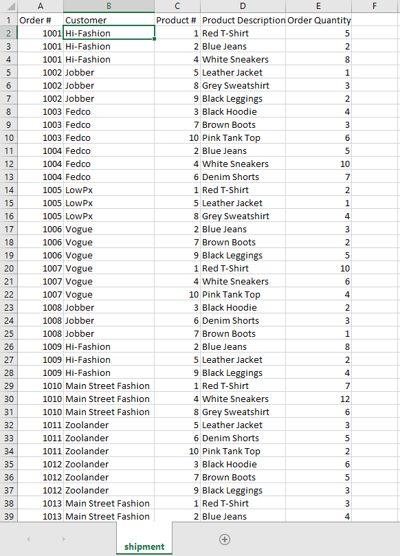
  • Select the shipment$ table and click "Finish" to load the table.
  • The inventory report should be loaded.  Click "Close" to review the data.
  • The data should be loaded.  
  • To get the pivot table data for the inventory, I use Power Query to transform the data and make it a table for the pivot table.  Go to Data ribbon and click "Get Data" and select "Launch Power Query Editor."
  • Click "New Source," then "File," then "Microsoft Excel" to link to the inventory report file.
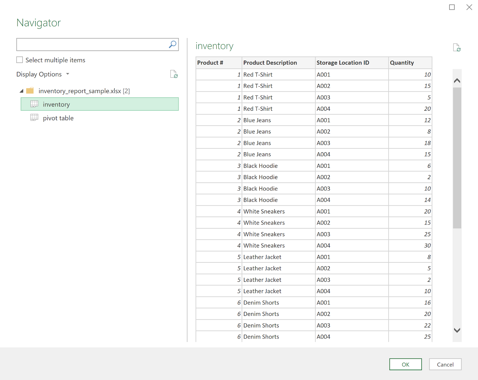
  • Select the "inventory" sheet and click OK.

  • I would change the query name so I know it's a query.  In this case I change it to query_inventory and press Enter.
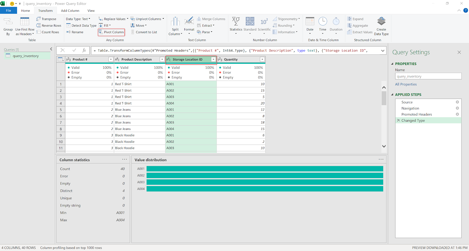
  • I want to create a pivot table with multiple storage locations as new columns, instead of the current format showing different storage location under the same columns.  The value column will be the quantity. To create this pivot table, select the Storage Location ID column, then click Pivot Column in the Transform ribbon.

  • Select quantity as the value column, check the advanced tab to ensure the quantity is added together.

  • The resulting pivot table is what we need - each product # has multiple columns showing inventory at each storage location (A001, A002, A003, A004).
  • Click "Close & Load" under the Home ribbon to return back to Excel.
  • A new sheet with name "query_inventory" is created with the same information.  To add a total_inventory column for each product #, type "Total_Inventory" next to A004 and press Enter
  • In the cell below, add a formula "=sum(c2..f2)" and press Enter to add up the inventory quantity from all locations.  Query_inventory sheet was created as a table so formula is automatically copied to the cells below.  Noticed that even the formula is different from what I typed because it's been converted to table reference.

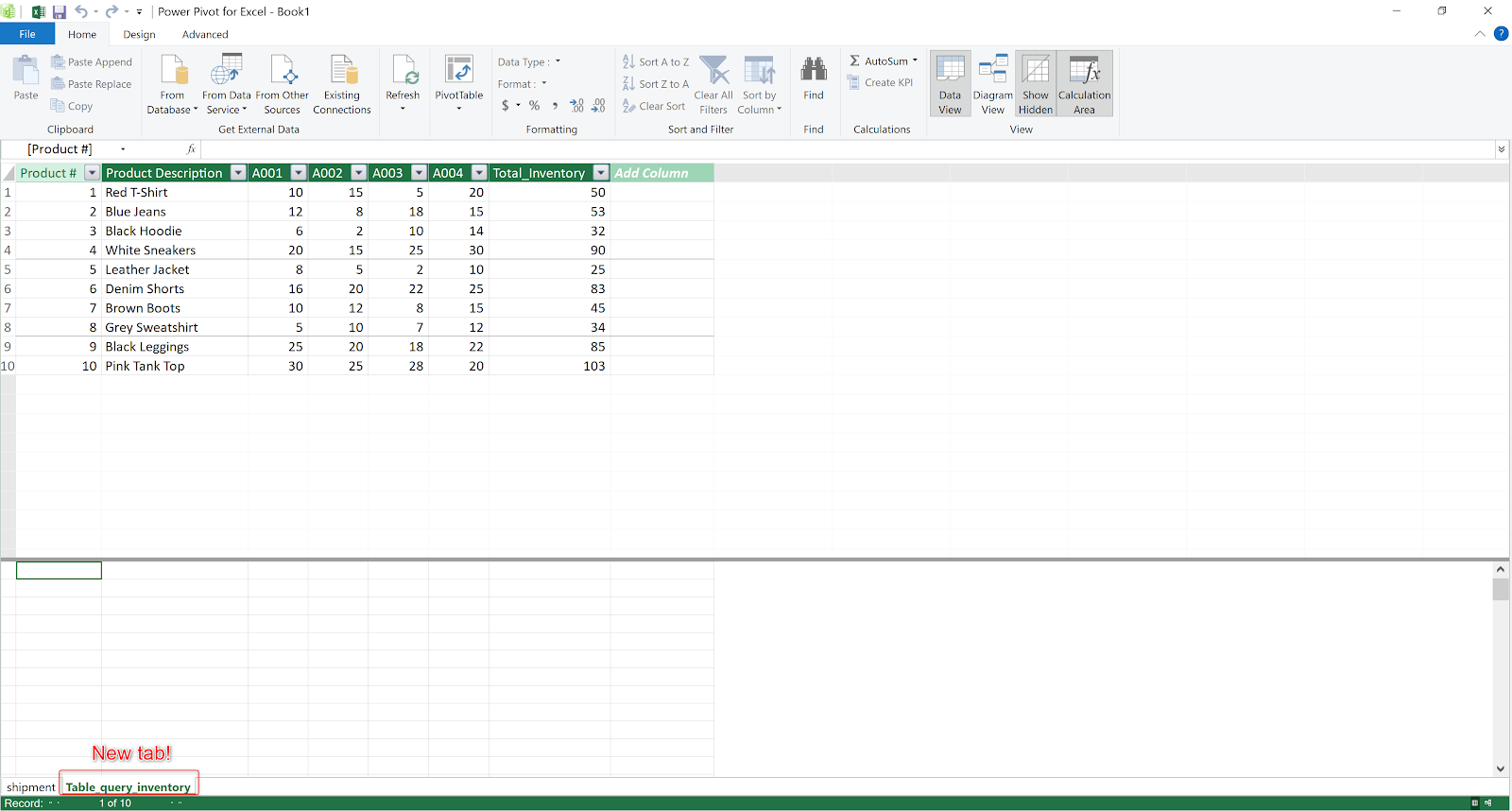
  • To create the relationship between query_inventory and shipment table, we need the query_inventory to exist in Power Pivot data model.  To do it, we can simply click "Add to Data Model" in the Power Pivot ribbon, and you will see a new tab "Table_query_inventory" created in Power Pivot for Excel.

Power Pivot for Excel new tab created!
  • The next step is to review and establish the relationship between Table_query_inventory and shipment table.  The easiest way is to click the Diagram View in Power Pivot for Excel, and drag the Product # from Table_query_inventory to the Product # of the shipment table.
Drag Product # from Table_query_inventory to Product # in shipment
Relationship established!
  • The last step is to create a pivot table from Power Pivot.  Click the PivotTable and select PivotTable from the selection.  A new pop up "Create PivotTable would show up.  Select New Worksheet and press OK.
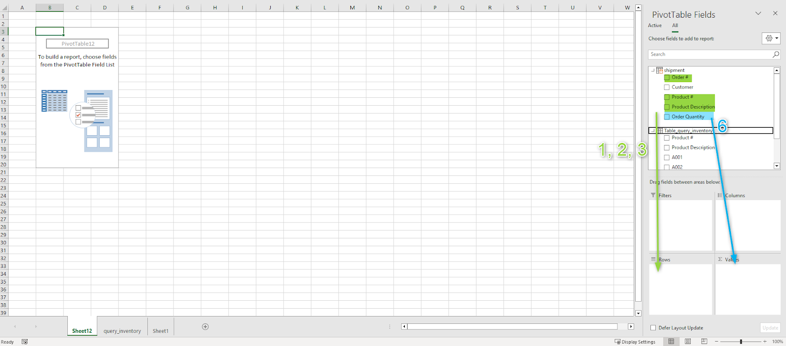
  • I want the pivot table to show Order #, Product #, Product Description, Total Inventory, inventory from different locations, then order quantity for the product #.  To organize the pivot table that way, we follow the order as such -
    1. drag Order # down to Rows
    2. drag Product # down to Rows
    3. drag Product Description down to Rows
    4. drag Total Inventory from Table_query_inventory down to Rows
    5. drag A001, A002, A003, A004 to Rows, in that order, below Total Inventory
    6. drag Order Quantity to Values

  • The resulting pivot table doesn't look quite right, but it's easy to fix!

  • Right click inside the pivot table, say around Red -T-Shirt, and click the Pivot Table Option.

  • Click the Display tab of the PivotTable Options window, the select "Classic PivotTable layout (enables dragging of fields in the grid), then click OK.

  • You should have a pivot table similar to what I have here now.  

Data refresh -

This is something interesting that I discover while trying to see how the data refresh is done.  Originally I thought if I do a refresh all within Pivot Table or Power Pivot window, all the data would get updated.  Unfortunately this is NOT the case.  The query is updated when we do a refresh all at pivot table or within Power Pivot window, but the table inside the Power Pivot window is not updated until we do another refresh all.  I'm not sure why this is the case as I would expect the updated query to be fed into Power Pivot table and the pivot table accordingly.

That said, to be safe, please go to Query ribbon and manually refresh the query data before refreshing pivot table data.  This will ensure the pivot data is updated.  Furthermore, we probably want to change the pivot table options so that the data is updated every time the worksheet is open.


Conclusion

This project took me longer than I expected.  I spent a lot of time trying to figure out the correct database layout, which isn't what was the original ask.  I also spent a lot of time trial-and-error with Power Pivot and Power Query, until I found this short article on Microsoft site "How Power Query and Power Pivot work together"...

Lesson learned - evaluate what is being asked and provide the quickest, easiest solution.  It doesn't have to the best solution because the user doesn't have all the time in the world to wait for that great solution.  😞

Misc info:

Possible next steps - create a report using Power Query or PowerBI, or Python.

Power Query Query Settings pane - I believe by default the Query Settings is hidden.  To show this pane, go to View ribbon and click Query Settings.  Then the Query Settings pane will show up.  It is like a history pane showing all the steps that have been applied to this query.


Sample data created by ChatGPT.

Google Data Analytics capstone project

Google Data Analytics capstone project

I decided to use blog as the venue to publish my Google Data Analytics learning because I wasn't sure how I can upload the findings, the...