I didn't have the chance to use bubble chart in the past because I didn't need a chart to show three numerical categories. My wife was given the bubble chart to review her business status and I had the chance to play with Excel's bubble chart capability. Long story short - in my opinion, Excel bubble chart process can be tedious if your data layout doesn't fit Excel bubble chart's input method. I figure if it's such a pain for me to set up a bubble chart, I might as well take this opportunity to document the process with some made-up data table and put it on the interweb. 😶
A sample data file can be found here (file name - bubble example.xlsx, sheet name - data). The example is made using the Doll's data - Basic, Deluxe and Accessories.
I'm thinking to create a bubble chart showing the progress from 2010 to 2015, with x-axis being the year, y-axis being GP%, the the bubble size being Sales / SKU.
Then click Insert - scatter chart (the icon next to pie chart).
Then a bubble chart will be inserted!
You can either use the top menu - Chart Design and Format to make changes to the chart, or you can use the three icons. This is where your familiarity with Excel chart options will be required to find all the options to update the chart.
Select the chart and three icons will show up on the side of the chart - a +, a brush, and a filter.
- + icon gives you the options to update chart elements.
- Brush icon give you the options to update the chart style and colors.
- Filter icon lets you select / update the data for the chart.
To modify the first set of data, go through the below steps -
- Series name - select any of the cell for the Basic product description (cells E7 to J7). Note that Series name can only take one cell value, not a range of cell values.
- Series X values - Excel was able to identify the years (2010 to 2015 / cells E5 to J5) as the X values.
- Series Y values - Excel was able to identify the GP% (cells E13 to J13) as the Y values.
- Series bubble size - for this chart I want to see the Sales / SKU for the bubble size, so I select cells E10 to J10 for this.
- Sometimes Excel would keep the previous value in the selection so double check what's placed inside each selection before you click OK.
To add another data series (for Deluxe and Accessories), select Add and click OK.

Excel animated bubble chart example - I found this guy's YouTube video while looking for an animated bubble chart solution. Take a look (link) and download his example file to see how it works. I was able to add up to 10 "categories" (instead of 6 in his example) by modifying his code a little. The data can be a little too busy when you have many bubbles moving at the same time so maybe 6 categories is more than enough. You can also select individual category to review all the products under that category. Credit to indzara
Go through the same steps to fill in each block, for Deluxe and Accessories.
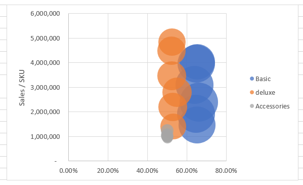
Then the chart will have three sets of bubbles - blue (Basic), orange (deluxe) and grey (Accessories).
- You can add title, axis labels, data callout, etc., by clicking the + icon / Chart Elements once you select the chart.
- You can also display different data labels by going through More Options under the Data Labels.
- You can filter which data to display by clicking the filter icon and check the data series accordingly.
Personally I don't like using year on X-axis so I modify the chart to show GP% on X-axis, Sales / SKU on Y-axis and use the Sales for the bubble size. The revised chart clearly shows the Sales / SKU dropping, except the chart does not show time scale.

Searching on Internet, I was able to find an animated bubble chart (credit indzara) and plug in the data. The resulting video is show below. You can follow the link below to download the template and play with it. However, this template uses macro so make sure your Excel can use macro enable file.
Excel animated bubble chart example - I found this guy's YouTube video while looking for an animated bubble chart solution. Take a look (link) and download his example file to see how it works. I was able to add up to 10 "categories" (instead of 6 in his example) by modifying his code a little. The data can be a little too busy when you have many bubbles moving at the same time so maybe 6 categories is more than enough. You can also select individual category to review all the products under that category. Credit to indzara
Possible future projects -
- Implement bubble chart with animation using Python. I'm curious if Python implementation of bubble chart would be less tedious as compare to Excel. 😒
Files location - link
Note that they don't work with Google Sheet.
- bubble example.xlsx
- animated bubble.xlsx (note this will macro to execute)
ChatGPT update as of 01/16/2023 - ChatGPT is giving the world a spin. I see people commenting what it can do on YouTube and Twitter, and schools working to re-imagine the future of education. It is a tool with great power for demonstration purpose. I'm still exploring it at this time and am amazed by some of the results (unfortunately not all). Perhaps the result is formed based on how the questions are asked, similar to when Google started years ago.


